Web Design 101: Clean, Modern, Whitespace
Published May 23, 2024Web Design 101: Clean, Modern, Whitespace
What is white space in web design?
White space, also known as negative space, is the area of a web page that is not occupied by content. That content could be text, buttons, images, or video. The white space is the room you give that content to breathe.
This includes the margins, padding, and gutters. Any space between the different visual elements in your web page. But it also affects typography. Letter spacing and line height are also a form of micro white space.
Why is white space important?
White space plays a crucial role in web design by:
- Improving readability: White space helps to break up text and make it easier to read. It also creates a sense of order and hierarchy, guiding the user's eye to the most important elements on the page.
- Creating visual interest: White space can be used to create visual interest and add emphasis to certain elements. For example, a large block of white space around an image can help it to stand out. Establishing a consistent visual style: White space can be used to create a consistent visual style throughout a website. This helps to create a sense of unity and makes the site look more professional.
- Improving user experience: White space can help to improve the user experience by making a website easier to use. It can reduce clutter and make it easier for users to find what they are looking for.
Looking at the big guys
Take a closer look at big companies that spend hundreds of thousands of dollars on branding. Their web designs are sleek and modern.

Here's another one.
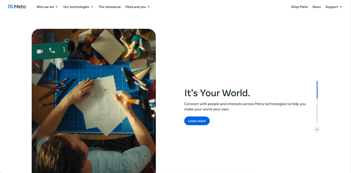
They look good. You can see it. But why? There's a lot of reasons.
But one of the huge ones is always there.
Consistent white space.
Good vs Bad
Okay, but we don't have hundreds of thousands of dollars to throw at branding. I feel that. Let's look at some businesses that feel more down to earth.
Here are some examples of credit union websites that sit on each end of the whitespace spectrum.
First up, we have an example that is squashed, cluttered, and overwhelming. The last thing I would do is consider putting my money in an account here.

Let’s look at a credit union that does it better. Here’s a clean and modern website. From this website, you get the sense of professionalism, which immediately builds trust with potential members.

Doing it right
Be consistent
This is the most frequent mistake made with white space in websites.
It’s really easy too. Pick some max-width constraints for your layout. Use similar values for your margin and paddings throughout the design. Keep your line-height the same throughout your stylesheets.
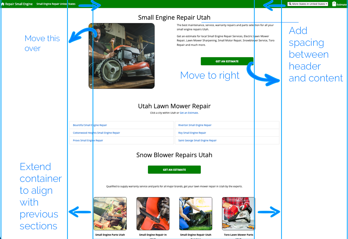
Grab a ruler
A level. A piece of paper. Anything with a flat edge.
Hold it up to your webpage. Do things line up with each other? If they don’t, fix it.

Here’s an example I found of a website that has white space and alignment issues. I’ve put notes on top of it to show how the developer could come back from this bad alignment situation.
It’s still plain, but it looks a lot more professional.
Make it feel good
And don’t leave it be until it does. This one can be harder to explain with words, so I’ll throw a visual example at you.
Here's a website I found. I've removed the logo.
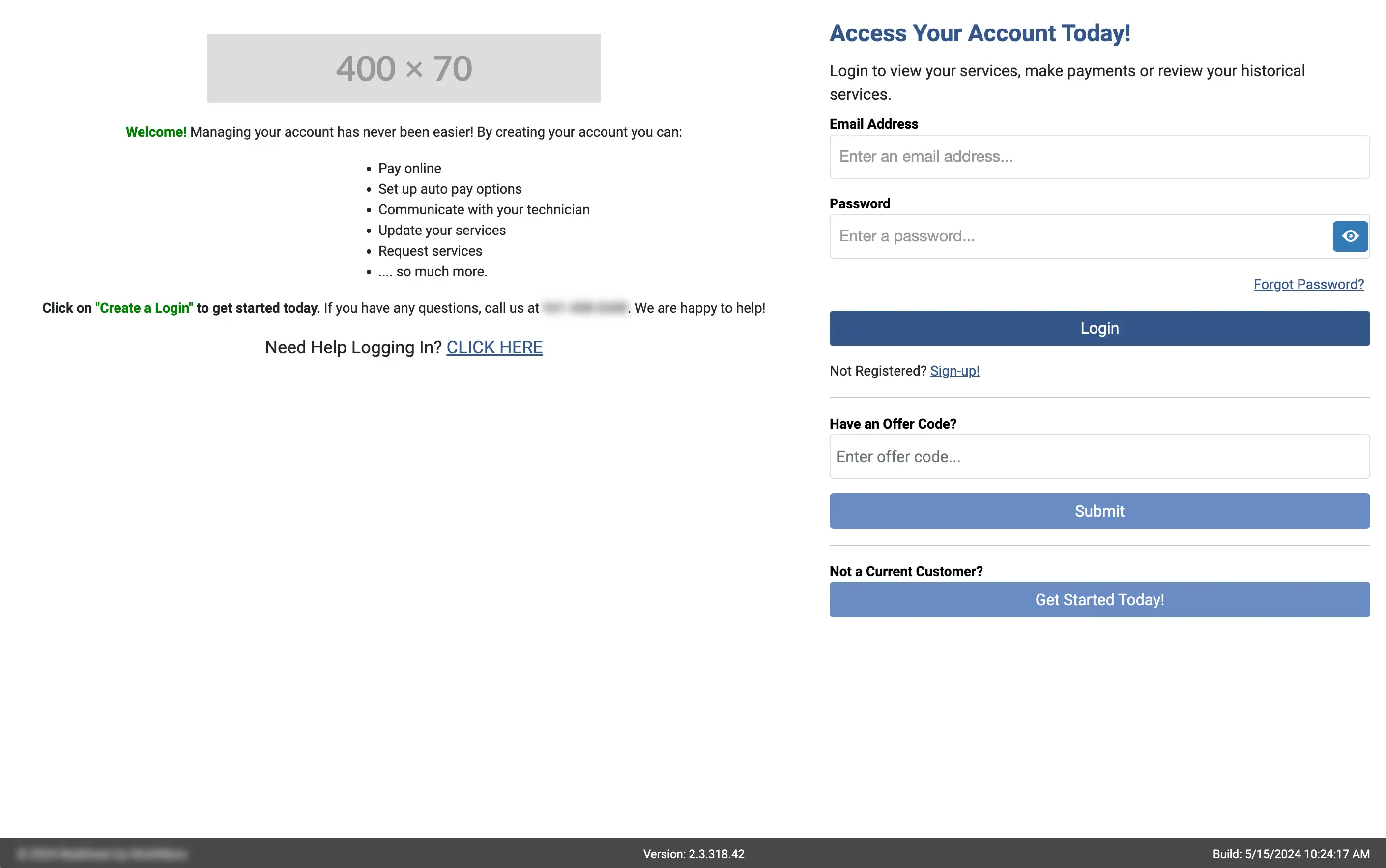
It feels bad. Unprofessional. It screams amateur.
Knowing how to make this look nice comes more naturally to some than others. The advice I have for those that struggle with this, is to find something similar that looks good, and imitate that in your own design.
That's a wrap
If you came here looking to learn, I hope you can take something from here and improve your website.
If you do, we'd love to hear about it! Show us your improvements on social media! We're active and follow back! We love following fellow businesses journey in improving their web presence! ❤️